 Scroll Down
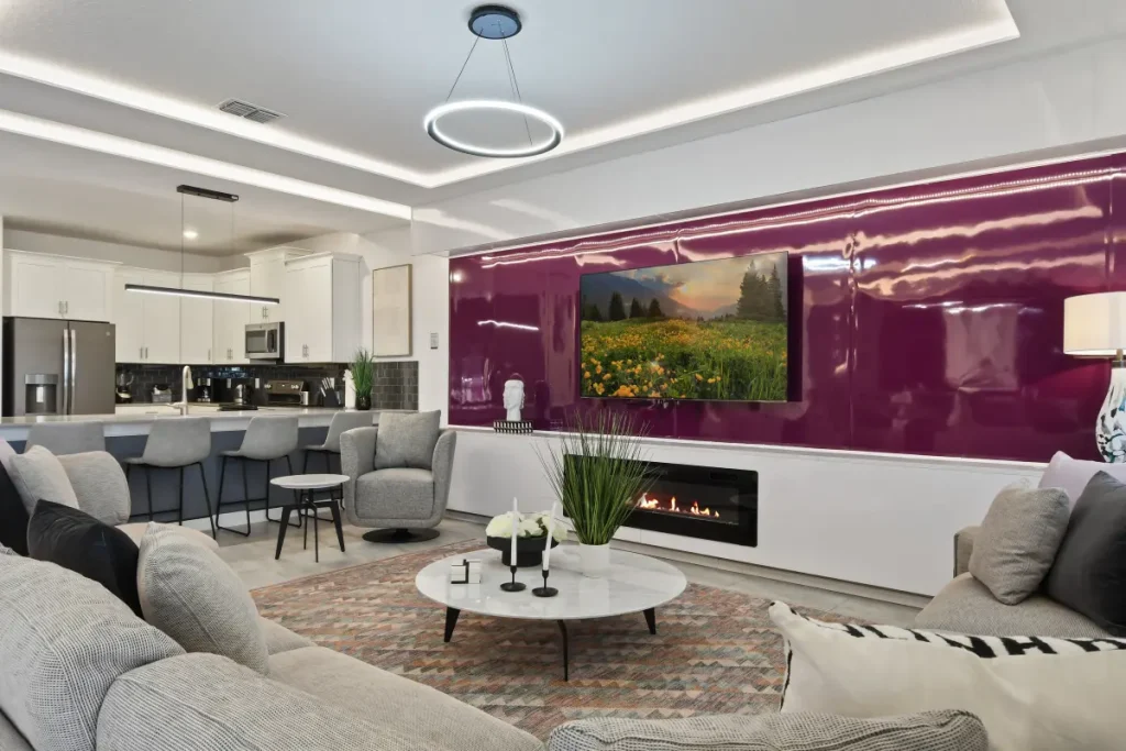
Choosing the right color palette for your vacation home is a crucial design decision that sets the mood, enhances the overall experience, and ensures that your property feels inviting and harmonious.
No matter if your vacation home is a beachfront retreat, a cozy cabin in the mountains, or a sleek city apartment, the colors you choose will influence the atmosphere and the way guests perceive the space.
A well-thought-out color scheme can make a property feel more spacious, relaxing, or even luxurious, helping to create an unforgettable stay.
Beyond aesthetics, selecting the perfect color palette also has practical implications. Colors impact lighting, temperature perception, and maintenance needs. Lighter hues, for example, can brighten up dimly lit spaces, while darker shades can add warmth and sophistication.
Additionally, some colors are more resistant to wear and tear, making them ideal for high-traffic areas or rental properties.
To ensure that your vacation home reflects your style while remaining functional and timeless, it’s essential to consider factors such as location, natural surroundings, and the emotions you want to evoke.
This article will walk you through key steps in choosing the perfect color palette, helping you create a space that balances beauty, comfort, and practicality.
1. Consider the surroundings and location
The environment surrounding your vacation home plays a significant role in determining the best color palette. The natural landscape, climate, and cultural influences can all inspire your choices and help create a seamless connection between the interior and exterior.
For homes near the beach, soft blues, sandy neutrals, and crisp whites can reflect the calming atmosphere of the ocean. Mountain retreats often look best with earthy tones like deep greens, warm browns, and stone grays that blend harmoniously with nature.
Meanwhile, urban vacation homes might benefit from modern, muted palettes with sophisticated neutrals and occasional bold accents. Here are some common vacation home settings and color palettes that complement them:
- Beachfront homes: Shades of blue, seafoam green, white, and beige for a light, airy feel.
- Mountain cabins: Warm earth tones like terracotta, deep greens, and rustic wood-inspired colors.
- Tropical getaways: Vibrant hues such as coral, turquoise, and sunny yellows to reflect the energy of the environment.
- Countryside cottages: Soft pastels, warm neutrals, and botanical greens for a cozy, welcoming aesthetic.
- Urban apartments: A mix of sleek neutrals like charcoal, taupe, and navy, with metallic accents for a modern look.
Taking inspiration from the surrounding landscape ensures that your vacation home feels like an extension of its environment. This not only enhances the aesthetic appeal but also creates a more immersive and enjoyable experience for guests.

2. Define the mood and atmosphere
Color psychology plays a crucial role in setting the mood of a space. Different hues evoke different emotions, and the right combination can create the perfect ambiance for relaxation, energy, or sophistication, depending on your goals for the vacation home.
Soft and neutral tones, such as whites, beiges, and light grays, promote tranquility and make spaces feel open and clean.
Warmer hues like terracotta, mustard, and rich browns add a cozy and inviting touch, while cooler shades like blues and greens create a sense of serenity.
If you want to add a bit of vibrancy, accents of red, yellow, or coral can energize the space without overwhelming it. Consider these color influences when designing your vacation home:
- Relaxing and calming: Soft blues, pale greens, lavender, and muted grays.
- Warm and inviting: Earthy browns, creamy beiges, warm oranges, and soft reds.
- Vibrant and playful: Coral, mustard yellow, bright turquoise, and bold greens.
- Modern and sophisticated: Monochromatic schemes with deep charcoal, crisp white, and muted metallics.
It’s also important to think about the activities your vacation home is meant for. If it’s a retreat for relaxation, opt for soothing tones. If it’s designed for social gatherings, bolder, energizing colors may be more appropriate. Aligning the palette with the intended use of the space will enhance the overall experience.

3. Balance light and dark tones
A well-balanced color palette includes a mix of light and dark tones to create contrast and depth. Too many light colors can make a space feel washed out, while too many dark hues might make it appear smaller and less inviting. A good rule of thumb is to follow the 60-30-10 rule:
- 60% dominant color: This should be a neutral or base color that covers most of the space, such as walls and large furniture.
- 30% secondary color: A complementary shade that adds depth, used for upholstery, accent walls, or cabinetry.
- 10% accent color: A bold or contrasting hue that adds personality through decor, throw pillows, or artwork.
This method ensures a visually appealing space that feels dynamic without overwhelming the senses.
Additionally, incorporating different textures and finishes can enhance the balance of colors. For example, pairing matte walls with glossy furniture or using textured fabrics alongside smooth surfaces can add interest and dimension.
Mixing warm and cool tones in the right proportions can also create a space that feels harmonious and well-composed.

4. Consider durability and maintenance
Since vacation homes are often used by multiple guests or rented out frequently, durability is a key factor when selecting colors. Lighter shades, while beautiful, can show dirt and scuffs more easily, whereas darker hues or mid-tone shades tend to be more forgiving.
- High-traffic areas: Use stain-resistant and washable paints in neutral or mid-tone colors.
- Outdoor spaces: Opt for weather-resistant and fade-proof paints in colors that withstand exposure to sunlight and humidity.
- Furniture and fabrics: Choose upholstery and textiles in patterns or darker shades to hide stains and wear.
Additionally, different paint finishes offer varying levels of durability. Glossy or satin finishes work well in kitchens and bathrooms because they are easy to clean, while matte finishes are ideal for living spaces where a soft, sophisticated look is preferred. Investing in high-quality paints and materials will help maintain the beauty of your vacation home with minimal upkeep.
5. Test colors before committing
Lighting and space conditions can significantly alter the way a color appears, so it’s essential to test shades before making a final decision.
Natural light, artificial lighting, and the surrounding decor can impact how colors look at different times of the day. Tips for testing colors:
- Paint sample swatches on different walls and observe them under various lighting conditions.
- Use large fabric or wallpaper samples to see how patterns and colors interact in the space.
- Consider digital mock-ups to visualize how different colors will look together.
Another helpful trick is to analyze how the color interacts with existing furniture and decor. Some colors may bring out unwanted undertones when placed next to other elements in the room. Taking the time to experiment with different shades ensures a well-coordinated and visually appealing final result.

6. Add personal touches and accents
While a cohesive color palette is essential, incorporating personal touches can make the space feel unique and inviting. Small pops of color, artwork, and decorative elements allow you to add personality without overpowering the overall design.
- Statement furniture: A bold-colored sofa or armchair can become the focal point of a room.
- Decorative accessories: Rugs, pillows, and vases in accent colors add depth and texture.
- Art and wall decor: Local artwork or nature-inspired prints can enhance the theme of your vacation home.
Layering textures and patterns can also bring depth to the color scheme. Consider mixing materials like wood, metal, and stone to add visual interest. The key is to strike a balance between a cohesive design and elements that reflect your personal style.

Creating a timeless and welcoming space
Choosing the perfect color palette for your vacation home requires a thoughtful approach that balances aesthetics, functionality, and emotional impact. By considering the location, defining the desired mood, balancing tones, and prioritizing durability, you can create a space that is both beautiful and practical.
A well-curated color scheme enhances the overall experience, making your vacation home a place where guests feel comfortable, relaxed, and inspired.
Whether you opt for soothing coastal hues, warm and rustic tones, or a sophisticated modern palette, the right colors will bring your vision to life and ensure your vacation home remains a welcoming retreat for years to come.
At Veranda Interiors, we specialize in creating stunning, personalized designs that elevate the beauty and comfort of your vacation home. Our expert team carefully selects color palettes that reflect your style while enhancing the ambiance of every space.